You guys. There are many cool things that come with blogging territory, but one of the coolest has got to be this moment. When my friends at Sherwin-Williams asked if I would be interested in announcing their Color of the Year for 2015 it was one of those look around the room just to make sure they were talking to the right person moments! Man, they are the best.
When I learned what the color was, I was a little surprised. I was expecting something totally different like Rust or Olive or a deep grayish blue. But I actually LOVE the color and quickly warmed up to the idea of doing something different with it.
Want to know what it is?!
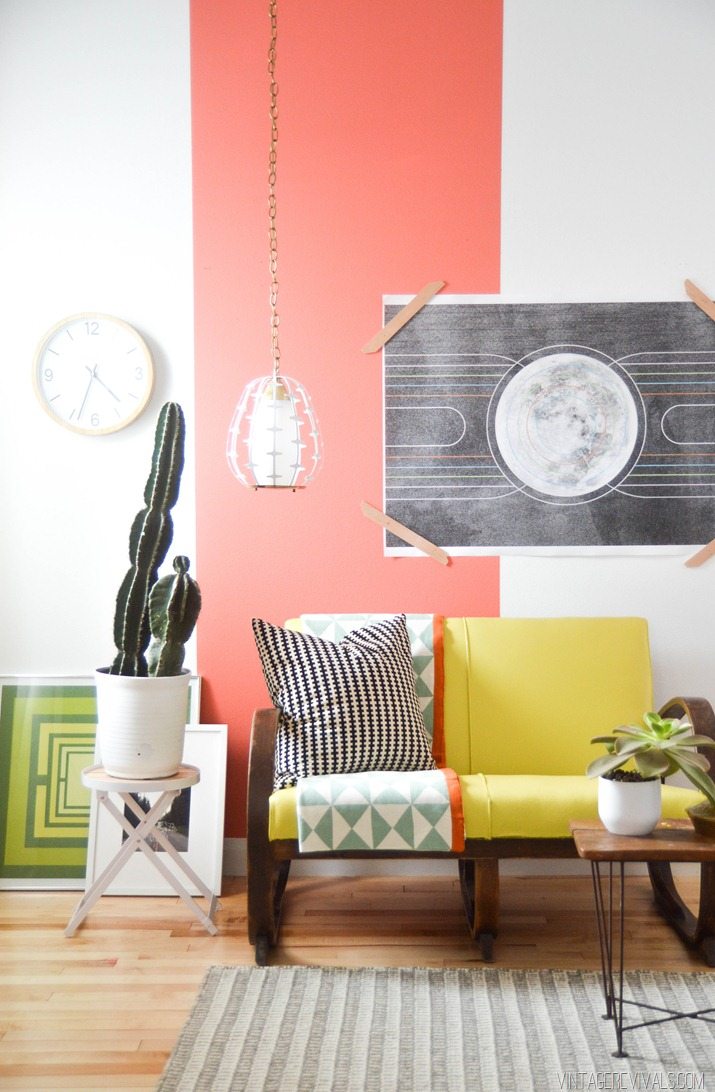
The Sherwin-Williams 2015 color of the year is Coral Reef!!
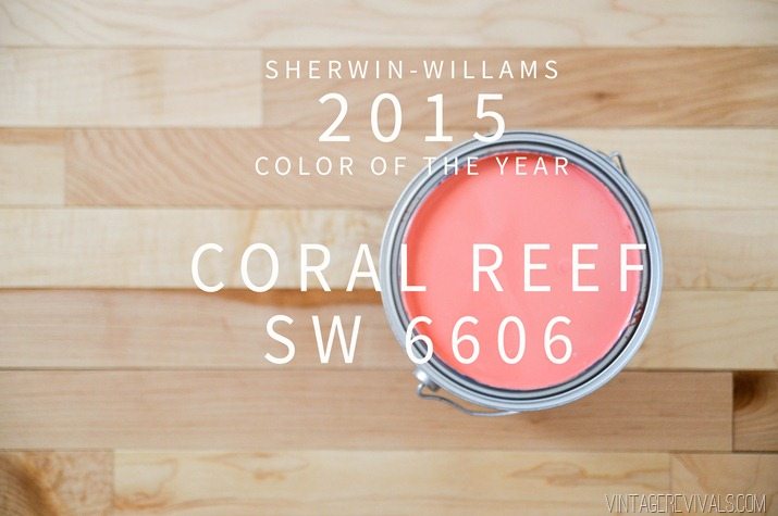
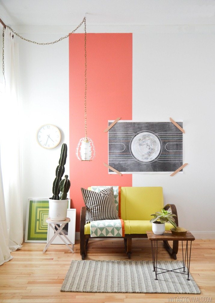
Coral Reef is such a versatile color. It goes with everything under the sun! Navy? Check. Cantaloupe? Check. Spearmint Green? Check. Blush Pink? Check Check Check!!
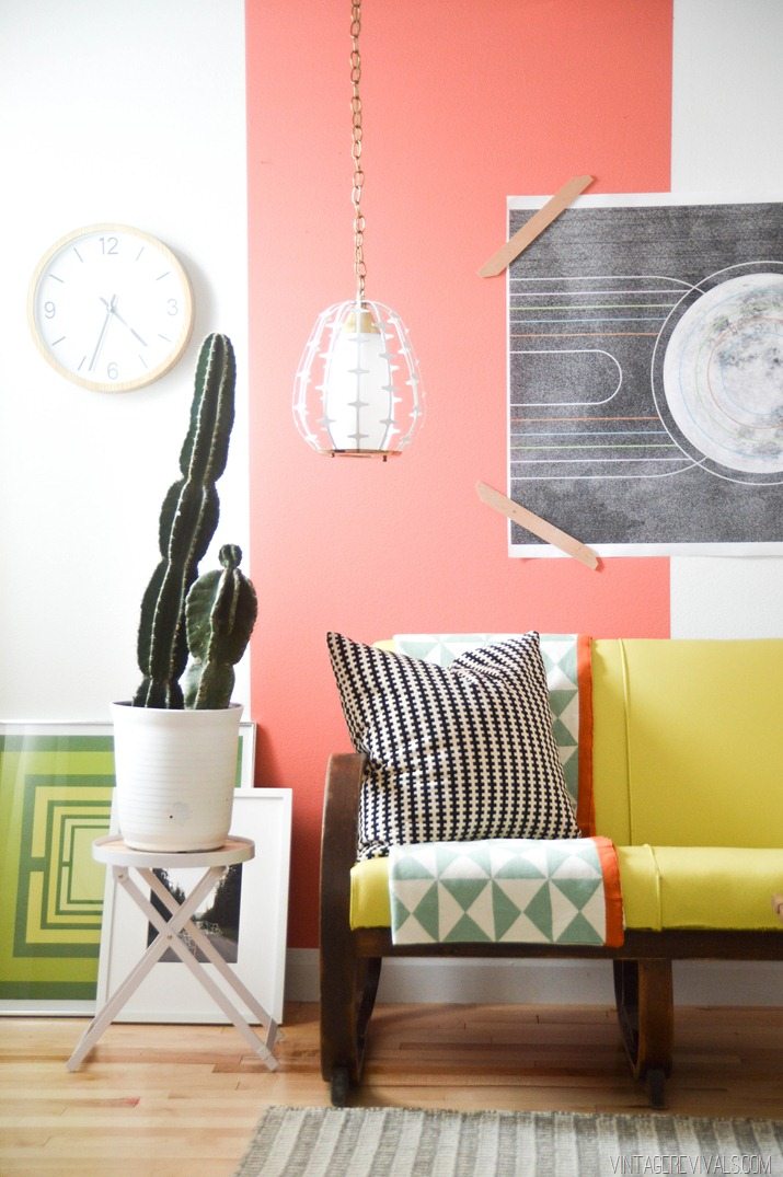
Acid Yellow? Obviously!! (No mint and chevron pairings here my friends!)
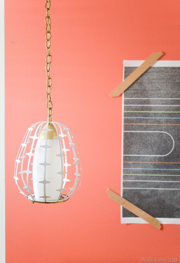
Lately I have been craving warm colors (Nugget I am looking at you). They just bring so much life into a space. Coral Reef is pretty much the queen of that little situation. I just haaad to come up with a way to show how current and wonderful it is. This basic wall treatment has been kicking around the ol’ creativity center for a bit. Painting an entire accent wall is great, but this project is simple and special. The conclusion is that a thick vertical stripe is absolutely stunning. Paired with Coral Reef it just cant be stopped.
So here is how to recreate this project.
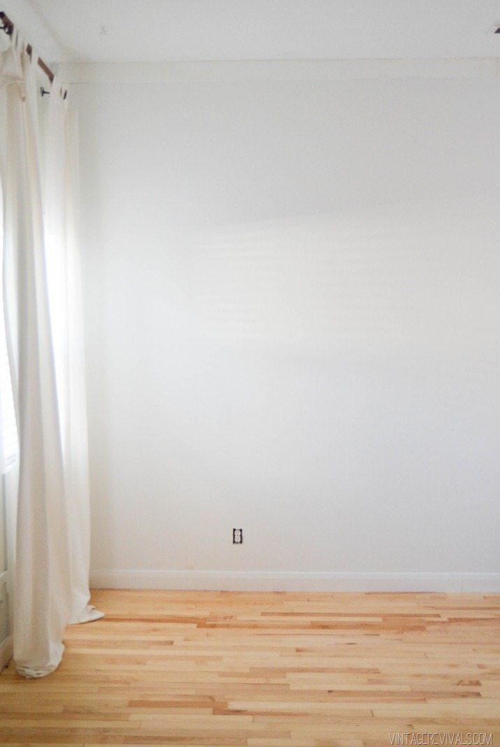
Start by painting your wall white. I use High Hide white (if your local Sherwin-Williams doesn’t know what that is it is an extra white base with 3 oz of white pigment added. It is my favorite white and I use it EVERYWHERE.)
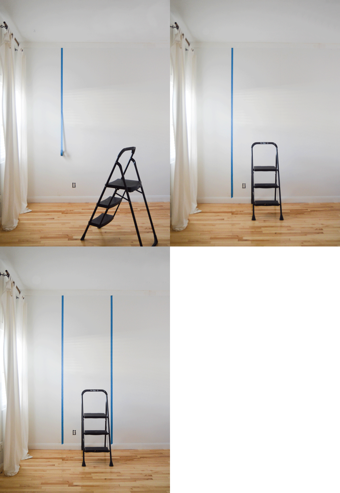
Using a level, draw 2 vertical lines 2.5 feet apart. Then using painter’s tape, tape on the outside of the lines.
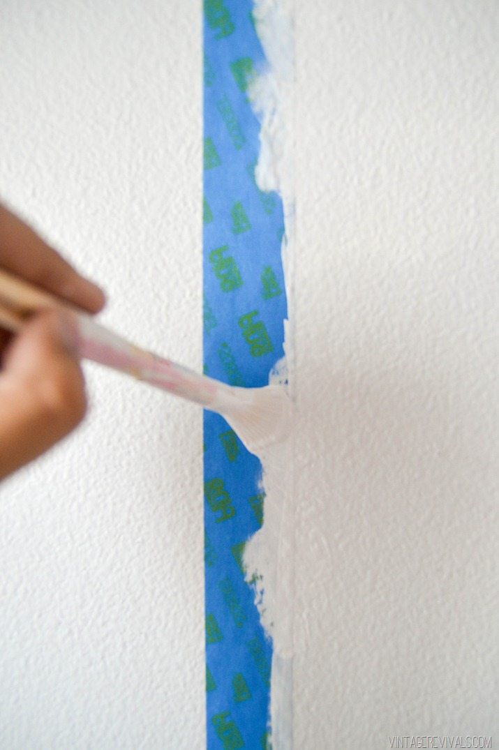
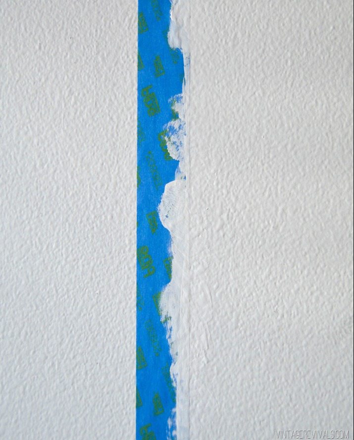
The trick to getting perfect paint lines EVERY TIME is to bleed your wall color before you paint your accent color. That way, the wall color fills the grooves and valleys in your wall texture instead of the accent color. To do this just paint along the edge of your tape line.
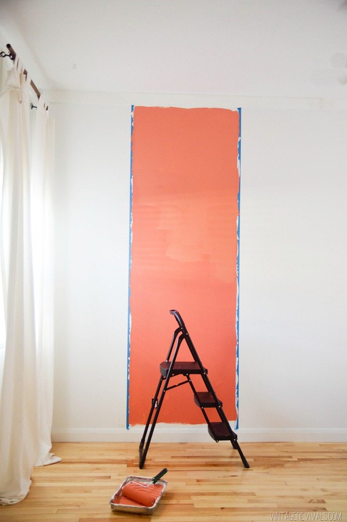
When your paint is dry, it is finally time to put the Coral Reef up!!
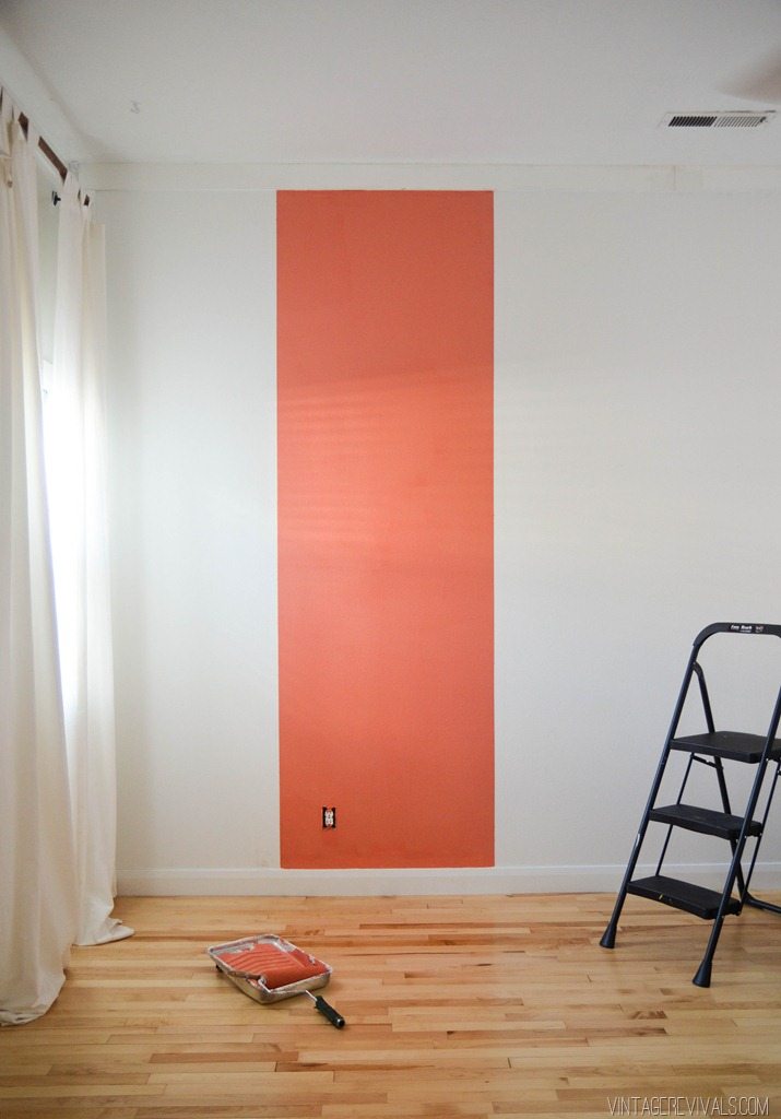
It is crazy how painting a stripe like this makes the ceiling look like it is miles away, and who doesn’t want taller ceilings?! Its like saying you don’t want to have a lifetime supply of Nutella. Or a cape for the man in your life after seeing Taylor Swift’s Blank Space video. Its just not a thing.
I love how this wall turned out. It adds just the perfect amount of color without overtaking your life. And I am SO excited to see all of the places that Coral Reef is going to pop up!!
So what do you think? Are you excited about their pick?
*I teamed up with my favorite paint company in all the land (Sherwin-Williams) to collaborate on this project. All opinions are my own!


I love that poster hanging up and the green one on the floor! Where are they from???
Where can I find that throw?
Oh wow, totally. I have that (or a similar coral colored) paint sample at home and my mom just bought coral for a “headboard” that we converted to a mirror. Sweetness!
Plus Sherwin-Williams moved about a block from my house so I painted the entire outside of my house this summer, and am working on finishing the inside this winter.
I love this! Since you listed your favorite white paint, I’d like to ask you a question about it. Would it work well with off-white accent pieces (ex: lamps)? We moved into our home a year ago, and the walls in our living room are a yellow-stained antique white color. It has been looking a bit drab, so I’ve been searching for the right white paint in hopes of making our space look a bit more modern. However, much of my decor (vintage lamps, owls, chairs, etc.) are more of an off-white instead of a pure white. Any suggestions on the best white to use?
i’m totally a year ahead or 2… my bedroom is a dark gray accent wall, and my night stand is basically close to that color!
I love it! I am totally going to use this color in my daughter’s bedroom with blush pink. So timely, I was just thinking…I need to find a good coral to paint a wall in your room! I love your blog so much…I don’t read many blogs, just no time, but your’s is so much fun and you are so creative, I just love it!!! Thank you!
seriously love this color.
I just watched Taylor’s blank space video because of this post. I’m still cringing everytime I thin about that beautiful car getting destroyed. Ouch.
This is such a great idea! Is this a new room makeover in the works? I am aware how stalkerish this sounds, but I don’t recognize the flooring as being in your house. Love everything you do. Thanks for the continuous inspiration!
Omg, this comment cracked me up.
WOW Mandi!!! This looks so great. You never cease to amaze me. So glad you are my daughter-in-law!!!!!!
YAY! I like it. Thanks for sharing this!
And EEEEasy on that light fixture. Heart went pitter patter upon seeing it!
I’m wearing a sweater that exact color right now!
Love it and I have been doing the same bleed trick for years. It never fails.
Love the throw! Where from?
You did a great job! I like how you “framed” that poster with the pieces of wood. I’d like to try doing that.
I’m really surprised that is the color they picked as the color of the year, though. I saw that color EVERYWHERE about two years ago. I painted a desk that exact color after finding it on a little lantern at Target. I usually feel like they are ahead of the curve, but in this case, I feel like they are about two years out of date.
Love that color. Just painted my bedroom that warm, luscious color and set it off with some turquoise.
Oh, I’m so excited! I’ve been hanging onto a pint of a coral color paint that I just didn’t know what to do with. I’m kinda stocked I’ll be using it while it’s a “hot” color! I really like the effect of the wide accent stripe. I don’t know that it’s something I can work into my home, but it’s beautiful nonetheless.
Your really are the best in all the land!
Fabulous color and even better announcer. They should have made a commercial with you in it!
Stunning, Mandi! Love it, love the whole ensemble.:)
Coral Reef… I’m a little surprised too. However, I’m totally in love with the color. All 4 walls of my office are coral actually. Love how you mixed it with the yellow [thank you so much for sparing us from chevron & mint]. I’m also having a little moment with how you hung that poster. Amazing.
Love, love, love coral! And I love how you styled it, as always!!
You are an awesome stylist.
i LOVE this color and the whole area you decorated is beautiful!
Love color! Hopefully, grays are out the window! You did an awesome job once again putting it together. Help! I have a question, you said the white was SW High White w/3 oz. White pigment, but in Macie’s you mention another SW fav Ultra White Base w/4 oz of white pigment. I would like to start with a clean pallet. BTW..Love your blog and enthusiasm!
It’s beautiful! And I really love the white. I have been looking for this! Do you think it would still be a good white with a terra cotta floor (saltillo / orange)?